

Greenflow
Greenflow required a clean, modern digital presence that aligned with its sustainability-driven positioning. The goal was to create a website that communicated credibility instantly while maintaining a minimal, distraction-free aesthetic.
The final solution focused on structured hierarchy, refined spacing, and strategic call-to-action placement — all built natively in Framer for performance and scalability.
Website Strategy, UI Design, and Framer Development
Framer
2026
Greenflow — Premium Framer Website Design Case Study | MadeByCebo
Explore how Greenflow’s modern minimal website was designed and developed in Framer to deliver clarity, trust, and conversion-focused structure.
Project Overview
Greenflow required a clean, modern digital presence that aligned with its sustainability-driven positioning. The goal was to create a website that communicated credibility instantly while maintaining a minimal, distraction-free aesthetic.
The final solution focused on structured hierarchy, refined spacing, and strategic call-to-action placement — all built natively in Framer for performance and scalability.
Problem
Greenflow’s brand required a refined online presence, but the digital structure lacked clarity and modern positioning. Messaging hierarchy was unclear, and there was no strategic content flow guiding visitors from introduction to action.
The challenge was to create a premium minimal interface that communicated trust while keeping the experience simple and intuitive.
Goals
Establish a clean, modern online brand identity
Clearly communicate services without clutter
Improve user flow from homepage to contact
Build trust through visual clarity and structure
Ensure seamless responsiveness across devices
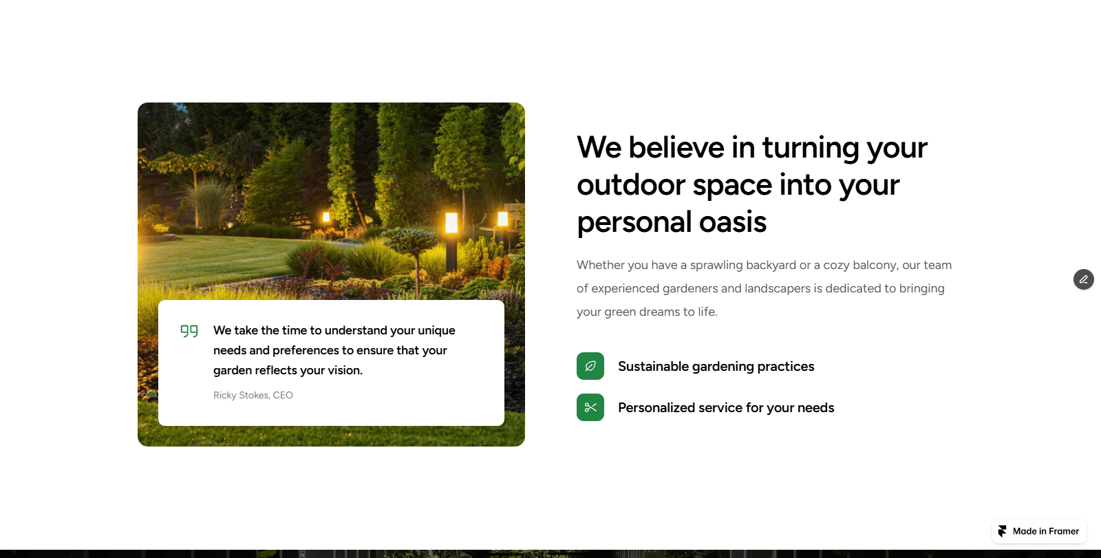
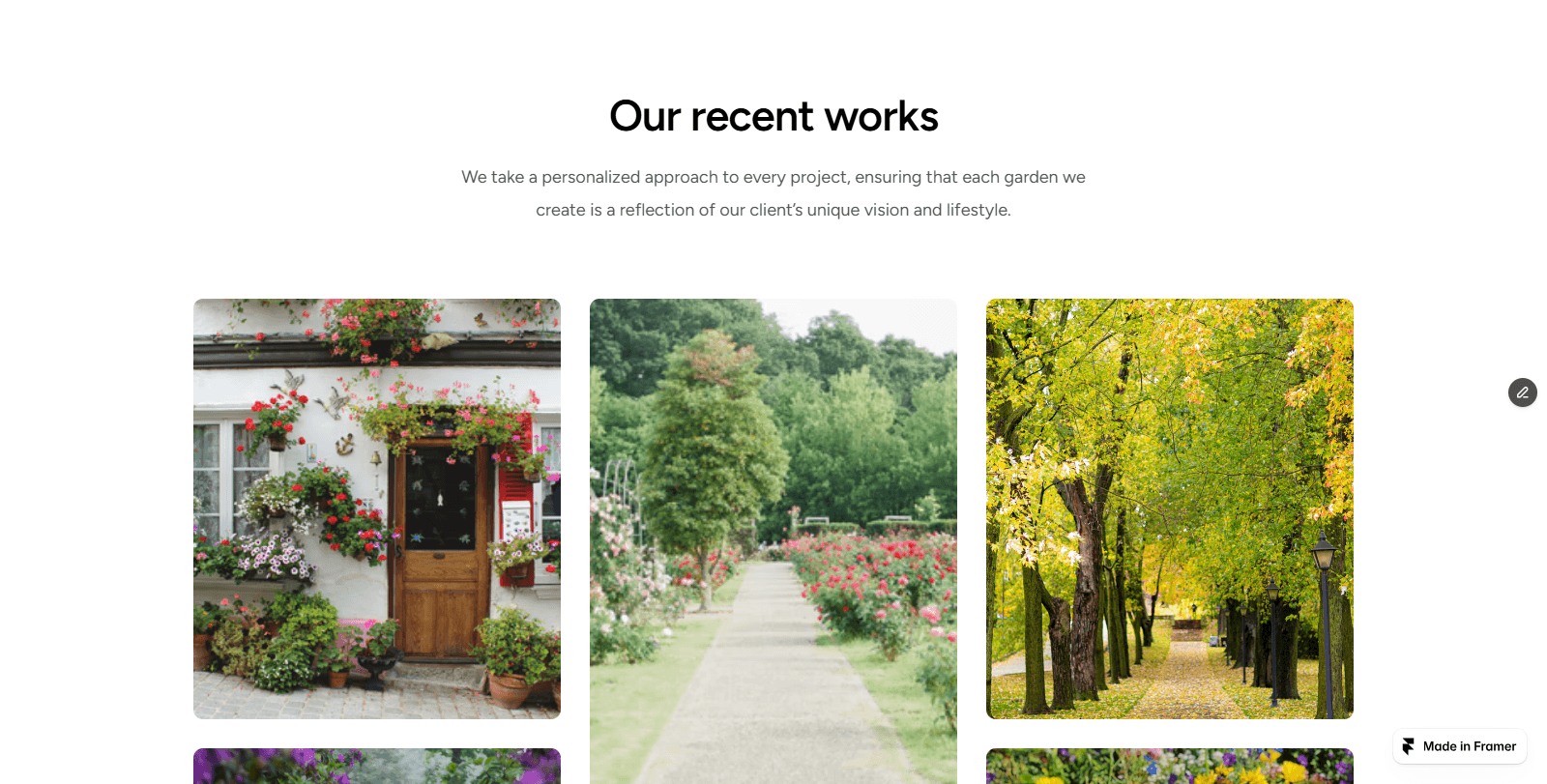
Process Overview
The design approach focused on clarity, spacing, and visual hierarchy.
Instead of overwhelming visitors with dense content, the structure was intentionally simplified:
Strong headline positioning above the fold
Clear service segmentation
Generous whitespace for breathing room
Consistent typographic rhythm
Subtle call-to-action placements
The goal was to guide users naturally from introduction → understanding → action.
Built entirely in Framer, the layout prioritizes performance, responsiveness, and scalability.
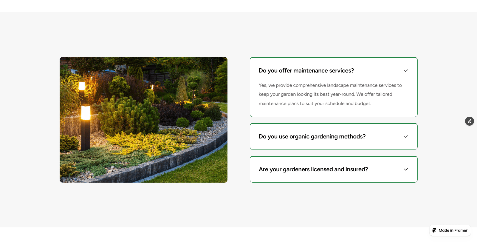
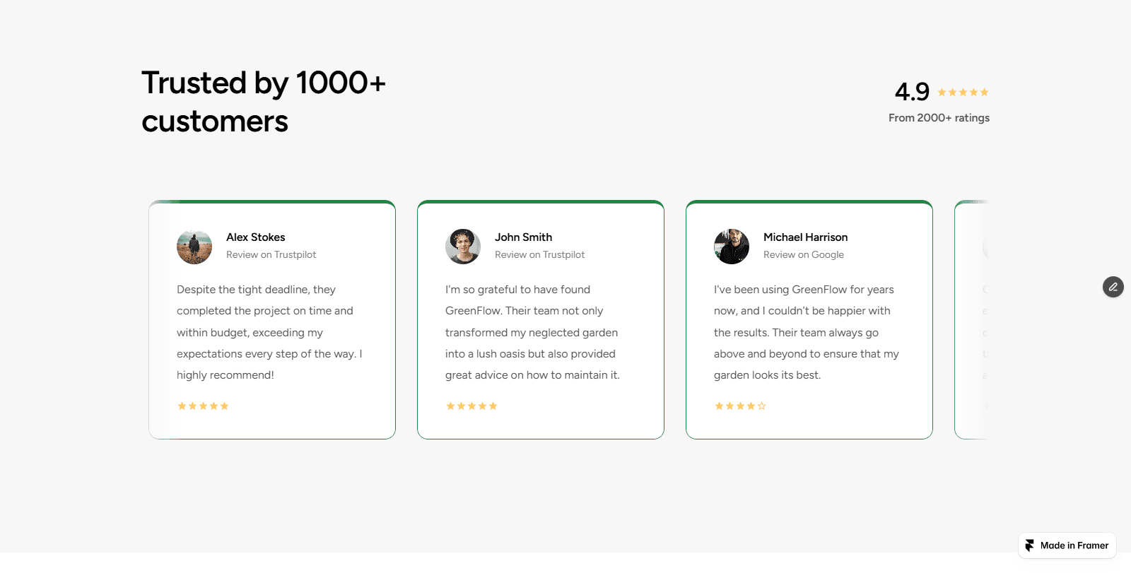
Strong headline emphasis above the fold
Generous whitespace for visual breathing room
Clean grid alignment for consistency
Minimal color palette with subtle accents
Strategic CTA placement without visual noise
The layout was intentionally restrained to elevate brand perception.
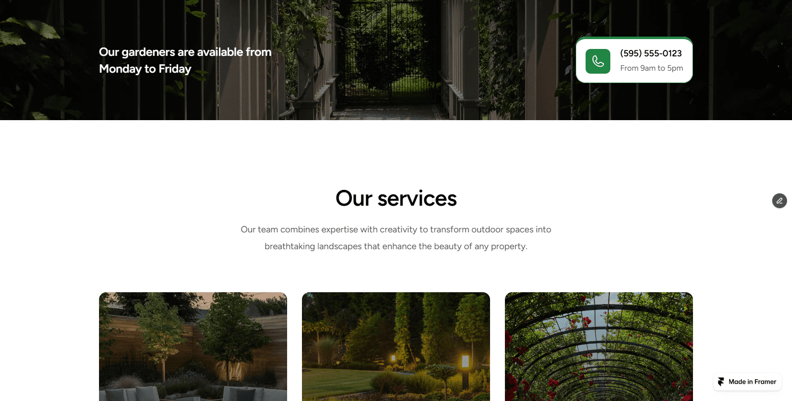
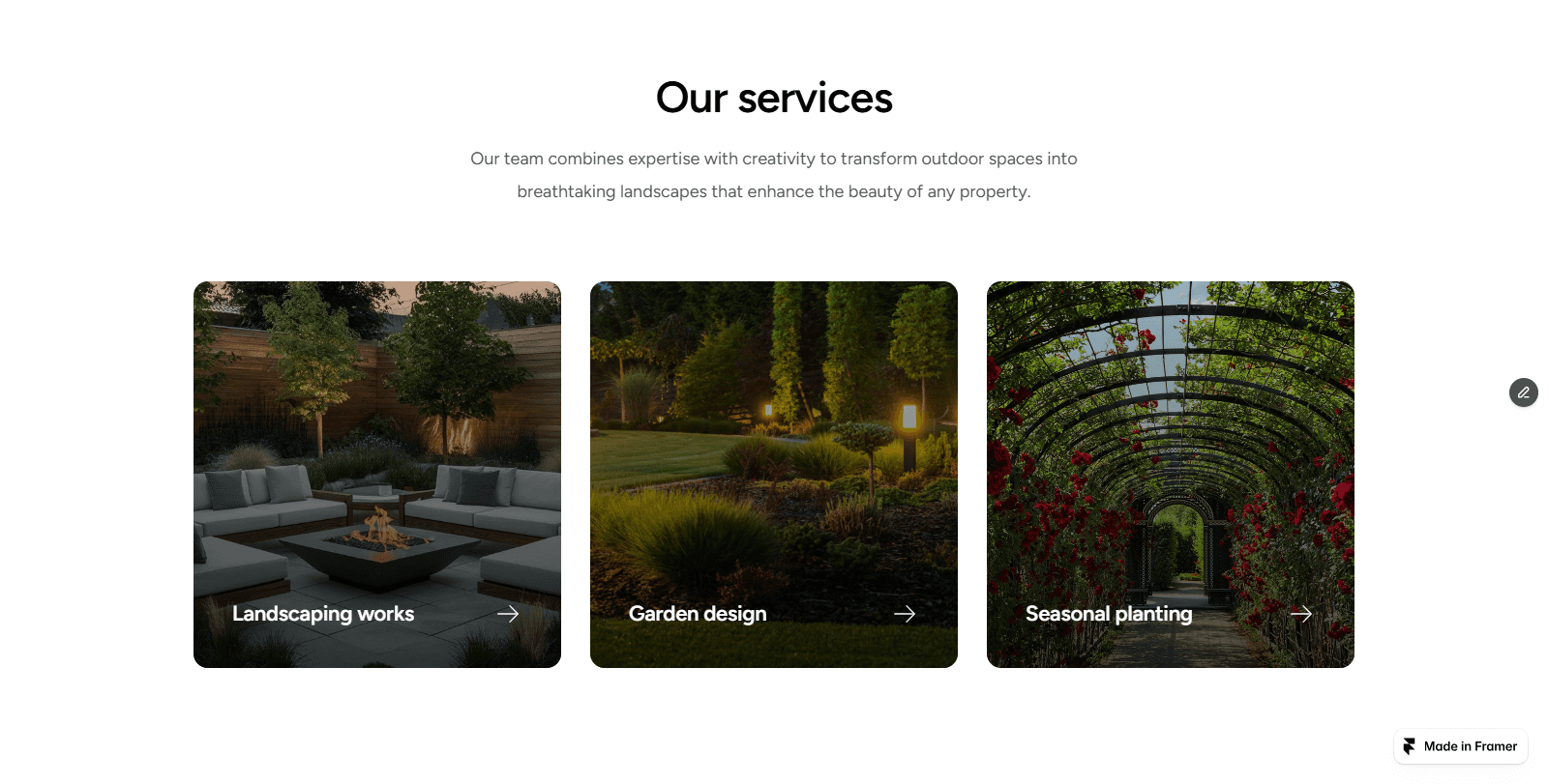
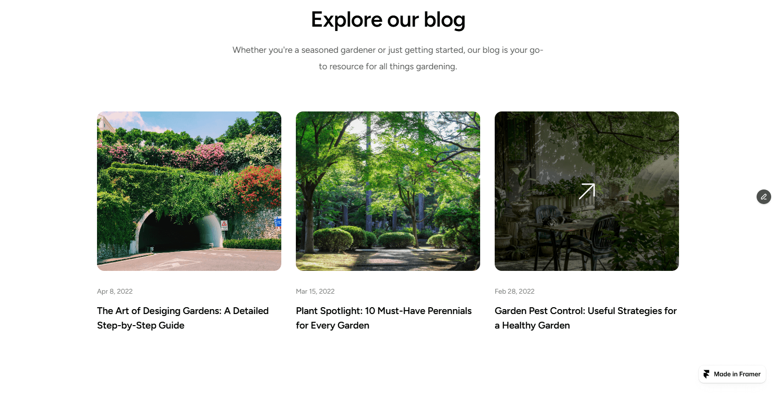
Clear service segmentation
Predictable navigation structure
Mobile-first optimization
Reduced cognitive load
Simple, visible call-to-actions
Every decision aimed to reduce friction and guide users naturally toward engagement.
Process Overview
The design approach focused on clarity, spacing, and visual hierarchy.
Instead of overwhelming visitors with dense content, the structure was intentionally simplified:
Strong headline positioning above the fold
Clear service segmentation
Generous whitespace for breathing room
Consistent typographic rhythm
Subtle call-to-action placements
The goal was to guide users naturally from introduction → understanding → action.
Built entirely in Framer, the layout prioritizes performance, responsiveness, and scalability.
Strong headline emphasis above the fold
Generous whitespace for visual breathing room
Clean grid alignment for consistency
Minimal color palette with subtle accents
Strategic CTA placement without visual noise
The layout was intentionally restrained to elevate brand perception.
Clear service segmentation
Predictable navigation structure
Mobile-first optimization
Reduced cognitive load
Simple, visible call-to-actions
Every decision aimed to reduce friction and guide users naturally toward engagement.
Outcome
The final website communicates clarity and trust immediately upon landing. The improved structure enhances user flow, supports conversion behavior, and positions Greenflow as a confident, modern service brand.
This project demonstrates how minimal design, when structured strategically, can significantly elevate brand perception.
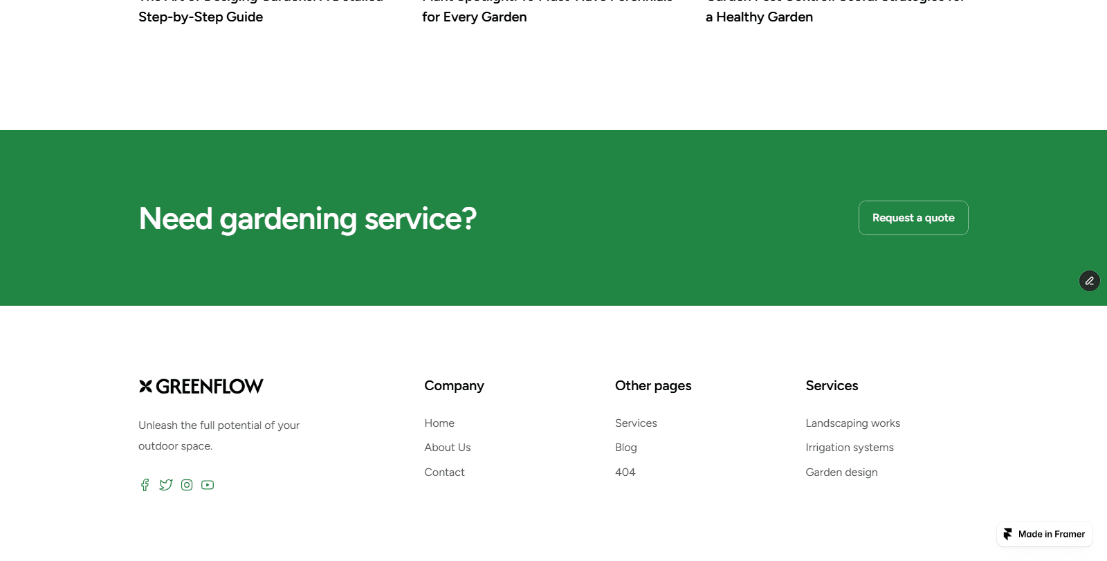
Custom Framer-built layout
Minimal, typography-led design system
Conversion-focused CTA placement
Fully responsive across desktop and mobile
Structured service presentation
Clean navigation architecture
Optimized visual hierarchy
Outcome
The final website communicates clarity and trust immediately upon landing. The improved structure enhances user flow, supports conversion behavior, and positions Greenflow as a confident, modern service brand.
This project demonstrates how minimal design, when structured strategically, can significantly elevate brand perception.
Custom Framer-built layout
Minimal, typography-led design system
Conversion-focused CTA placement
Fully responsive across desktop and mobile
Structured service presentation
Clean navigation architecture
Optimized visual hierarchy
Location: Johannesburg, South Africa
Copyright© 2025 MadebyCebo. All rights reserved.
Web Design in South Africa • Framer Templates • Landing Page Design • SaaS Website Design • Portfolio Websites • Freelance Web Designer in SA • remote web design services • remote web design services • freelance web designer in South Africa •